Last week, we took a look at Corsi and Fenwick numbers in predicting an NHL season by season points total. We looked at basic Corsi For and Fenwick For percentage (i.e., CF% and FF%), Corsi shot percentage (CSh%), Fenwick shot percentage (FSh%), Corsi save percentage (CSv%), and Fenwick save percentage (FSv%).
We found that Corsi and Fenwick numbers were much more effective in predicting season points total and overall team performance than just simple traditional statistics alone, like save percentage, offensive zone faceoff percentage, and the like. As such, one can form certain graphical and mathematical understandings of the relation between mainstream statistics and season points total.
But they have poor predictive effect relative to the Corsi and Fenwick numbers, which serve as a proxy for puck possession, with a greater proportion of puck control having a theoretical advantage in creating more scoring, less scoring for your opponent, and hence more wins and better team performance over the course of a season.
We can find the standard expected relationships between standard statistics and team performance when the former is regressed on season points totals.
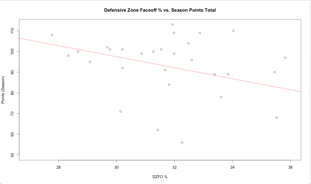
Teams with higher defensive zone faceoff percentages tend to have lower season points totals, which is reasonable given they’re frequently backed up in their defensive end:
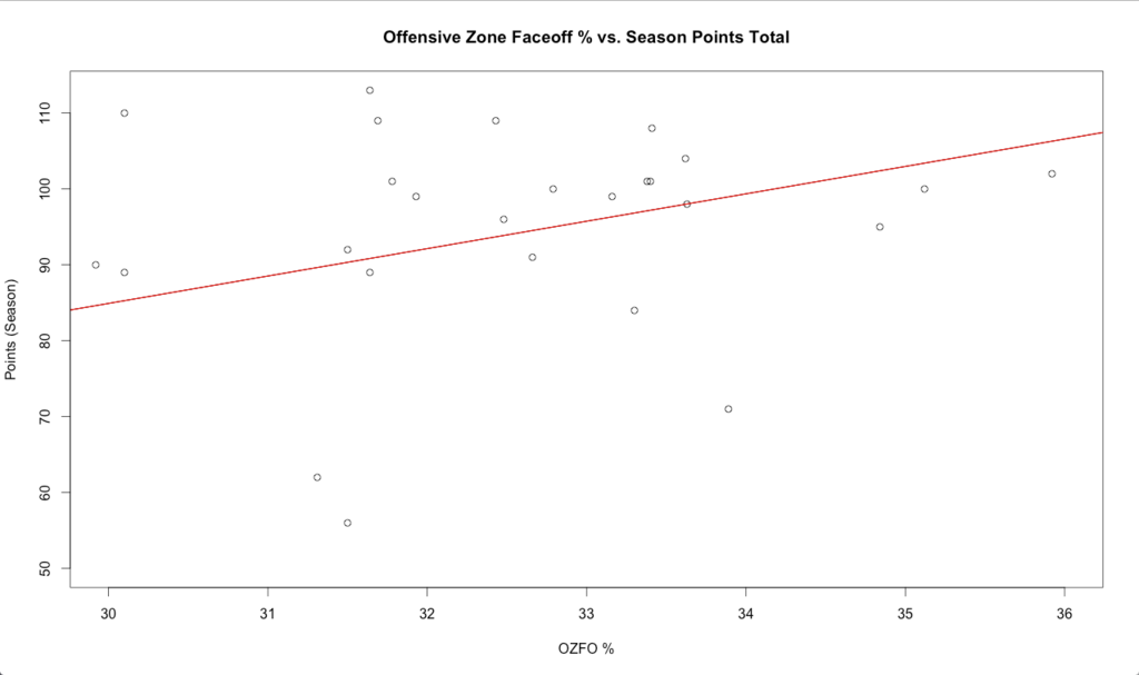
Teams with high offensive zone faceoff percentages often have higher season points totals, meaning they dominate the offensive zone more than the average team, leading to more goals and hence more wins:
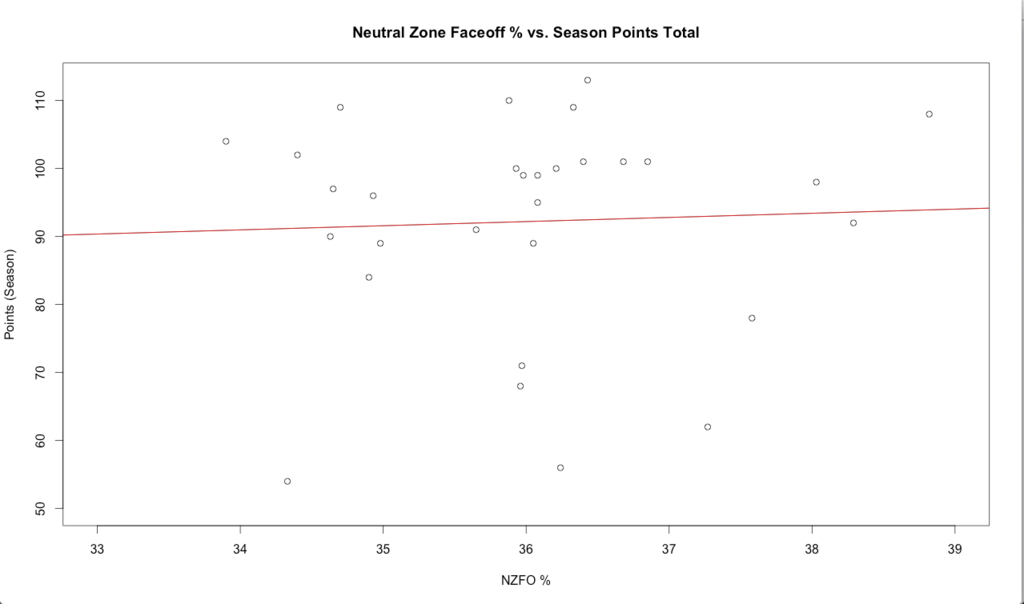
Neutral zone faceoff percentage understandably runs approximately flat with respect to season points totals:
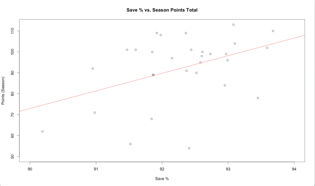
High save percentage goes well with greater season points totals.
There is nothing earth shattering about the revelation that a better goalie earns you more wins over the course of a season:
However, as just mentioned, all these metrics regressed against season points totals don’t predict future team performance as well as Corsi and Fenwick metrics.
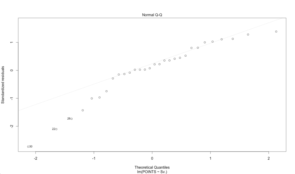
Moreover, using standard linear regression techniques for predictive effects can be tough when it comes to save percentage versus season points totals, given the normality assumption doesn’t hold very well, as tested by quantile regression (data points don’t fit the “straight line test”).
And PDO – called SPSV% in NHL circles – is one such metric. It is the sum of a team’s shooting percentage and save percentage. Corsi and Fenwick PDO are hence the sum of a team’s Corsi (or Fenwick) shooting percentage and Corsi (or Fenwick) save percentage.
Now that we know how CF%, FF%, CSv%, FSv%, CSh%, and FSh% effect season points totals, we can now venture more heavily into how Corsi and Fenwick based PDO affects season points totals. The four main questions we will look at include:
1. How well does the metric effectively predict season points totals?
2. How well did PDO data predict playoff results?
3. How does CPDO and FPDO compare in predictive effect relative to standard PDO?
4. Where should PDO, CPDO, and FPDO stand in the hierarchy of hockey analytic metrics?
Table of Contents
Results
When all four Corsi or all four Fenwick metrics (e.g., CF%, CSh%, CSv%, and CPDO) were regressed on season points total, only the CF% and FF% metrics were statistically significant. Nothing was even remotely significant when CF% and FF% were dropped from the regressions, naturally due to the heavy overlap in the variables.
Whenever regressions are run with heavy overlap (like regressions pertaining to a Corsi metric and the corresponding Fenwick variable), the magnitudes of the coefficients and the level of statistical significance shown by each will be spotty. After all, the only difference between Corsi and Fenwick metrics involves the component of “blocked shots.” And CPDO will overlap heavily with CSh% and CSv% given it’s the sum of those two variables. Mixing Corsi and Fenwick metrics in one regression will not be of much use accordingly.
Hence, the four main regressions that will be of some value are seasons points totals versus FF% and FPDO, seasons points totals versus CF% and CPDO, seasons points totals versus FPDO, and season points totals versus CPDO. When we run these four, the effect of each variable returns as extremely statistically significant.
Based on the results of each of these four regressions, each one-percent rise in CPDO or FPDO increased a team’s point total by between 13-18 points. This is a huge difference. This can mean the difference from being the #1 seed in the conference to being the #8 seed or possibly not even reaching the playoffs altogether.
FPDO classifies the three luckiest teams in the 2014-15 NHL season as:
-
-
- 1. NY Rangers – 101.65%
-
- 2. Colorado – 101.27%
-
3. Montreal – 101.16%
Based on the FPDO metric, which is worth about 12.5-13.0 points per season depending on the regression you look at (having extremely significant results, of which there is only two based on the regression models formulated as part of this study), that would coincide with about a 21-point drop for the New York Rangers, a 16-point drop for Colorado, and a 15-point drop for Montreal.
New York and Montreal were the top two seeds in the Eastern Conference and would have finished with 92 points and 95 points, respectively, with “league-average luck” based on these results.
That would be enough to drop the two teams to the seventh and eighth seeds in the conference. Colorado would have fallen from 90 points to just 74.
FPDO classifies the three unluckiest teams in the NHL in 2014-15 as:
-
-
- 1. Arizona – 97.97%
-
- 2. Carolina – 98.14%
-
3. Edmonton – 98.15%
These teams were considered the three unluckiest according to FPDO by a decent margin.
The fourth unluckiest, San Jose, was nearly an entire percent above Edmonton at 99.09%. Arizona could expect a gain of approximately 26 points (56 82); Carolina a gain of 24 (71 95), which would have tied for the eighth-seed in the Eastern Conference; and Edmonton a gain of 24 (62 86).
The most useful PDO regressions out of the four include Fenwick For % (FF%) and Corsi For % (CF%).
Quantile regression of the seasons points totals versus CPDO and season points totals versus FPDO illustrates data that doesn’t fit the normality test very well, making standard regression techniques more difficult to evaluate the predictive quality of PDO data.
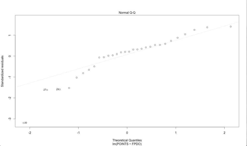
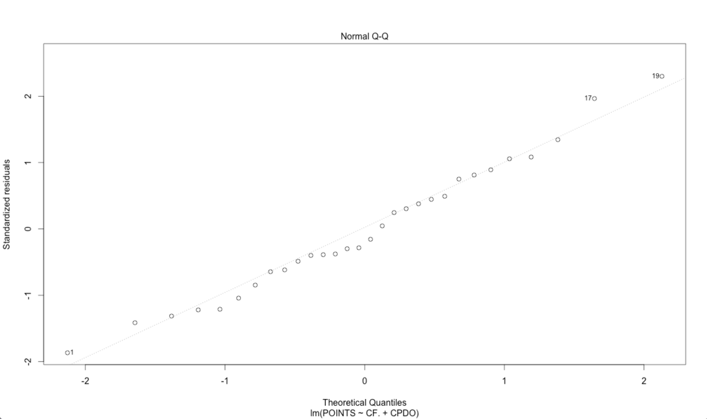
Combined with FF% (for FPDO) or CF% (for CPDO), we don’t observe this issue, and also corresponding achieve a higher R-squared to denote that our model accounts for more of the variance in the data.
Team Performance Sustainability by Season Points Totals
Plotting season points totals against FPDO and CPDO produces the following graphs:
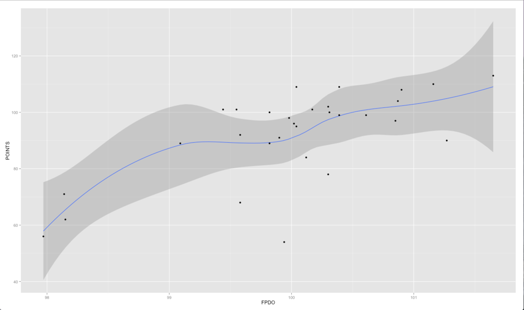
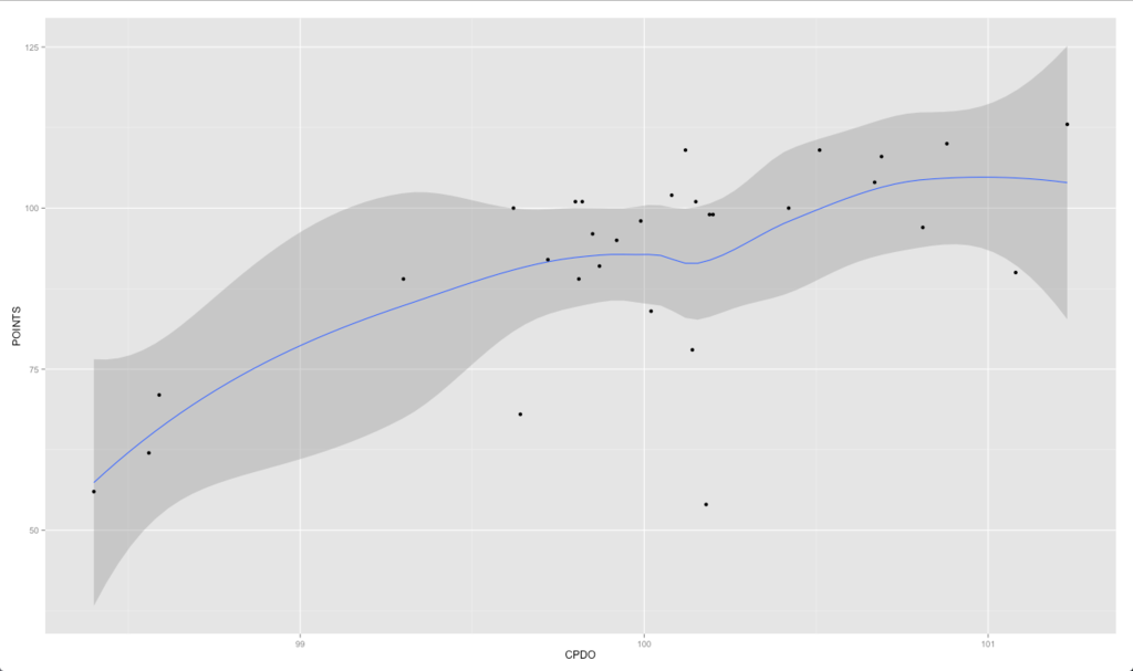
We can deduce the following takeaway points from these near-similar graphs:
1. What we see from the data is a steepening, non-linear effect of FPDO and CPDO at the highest season points totals.
This means that teams with the highest points totals at the end of a season largely get there based on a performance level that isn’t sustainable long-term.
In a league with heavy parity in terms of salary cap, draft position inverse of the 2014-15 season’s finish, and so forth, this should be expected.
2. A positive slope seen at the very left of the graph suggests that poor team performance is also a reflection of unsustainability in the same vein of what we see at the top.
Some team might be bad because they are legitimately poor performers and going through a purposeful period of rebuilding.
But in a league where each team is only allowed to go up to the exact same spending figure, and parity is inherently the expectation, PDO numbers suggest that a large degree of the variance in seasons points total may be due to random variation in season points totals.
That is, the discrepancy in performance between the top of the league and the very bottom may be attributed more heavily to “luck” itself, rather than genuine talent differences, better coaching, more progressive tactics, and whatever else may go into better team performance.
This could at least be partially reflected by the fact that the top four points-getters that season – NY Rangers, Montreal, Anaheim, and St. Louis – did not make the Stanley Cup Finals.
A middle-of-the-pack playoff team won the Stanley Cup (Chicago with 102 points, eleven points/5.5 wins behind the league leader).
This at least defends the notion of a large playoff structure. In the NHL, sixteen of the thirty teams make the playoffs.
And in a hard-capped league like the NHL, it is much more conceivable that a low- or mid-seed could win the Cup at the end. In an uncapped league – or even a soft cap (where teams can transgress a certain spending threshold if they agree to a type of luxury tax surcharge) – a higher seed would be much more likely to win the Cup as a genuine reflection of the fact that they have acquired more talent and very likely have higher economic resources willingly available to pay and keep those players accordingly.
A large playoff structure may also incentivize more competition.
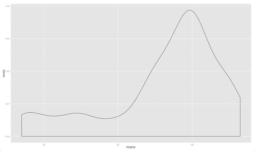
Based on a density plot of season point total (below), we see more of a non-traditional distribution.
There is a rectangular distribution at the very left of the graph, suggesting a certain few teams who understand they aren’t playoff contenders going into the year and are under a rebuilding process to acquire more overall talent – usually by trying to place themselves in better draft position, trading away current players for younger and/or higher-ceiling assets, even outright “tanking.”
Based on a simple eyeball test of area under the rectangular part of the distribution, this comprises perhaps 20% of the league – or around 5-7 teams. The remainder of the curve follows a standard distribution – denoting a normal genuine competition structure – and is rather narrow, with the bulk of the density coming around the 100 points mark.
3. For middle-of-the-pack playoff teams, luck is less of a factor.
The curve is relatively flat from 98-101 PDO*.
This suggests that Chicago likely wasn’t far behind the league points leaders at all. They were ranked just the 11th highest in terms of luck and had very high Corsi and Fenwick numbers, making their run to the Stanley Cup not all that surprising despite their mere status as a fourth-seed.
Based on these results, a combination of both standard Fenwick and Corsi metrics and FPDO and CPDO data predicted that season’s playoffs fairly well. Chicago certainly would have been a popular pick before the playoffs based on these results.
* 100 is considered the league-average PDO mark, as both shot percentage and save percentage should roughly equal 100.
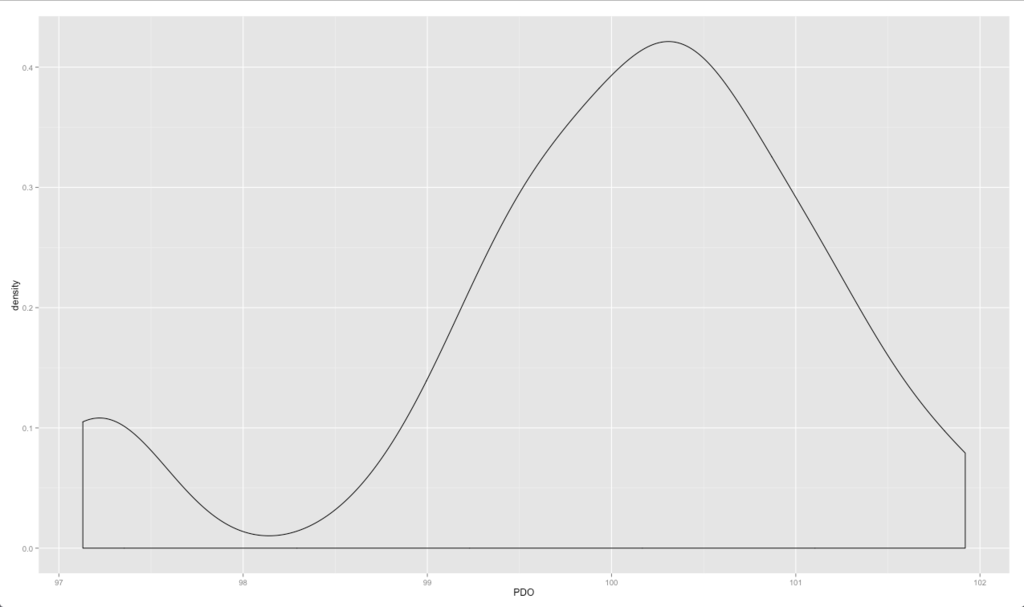
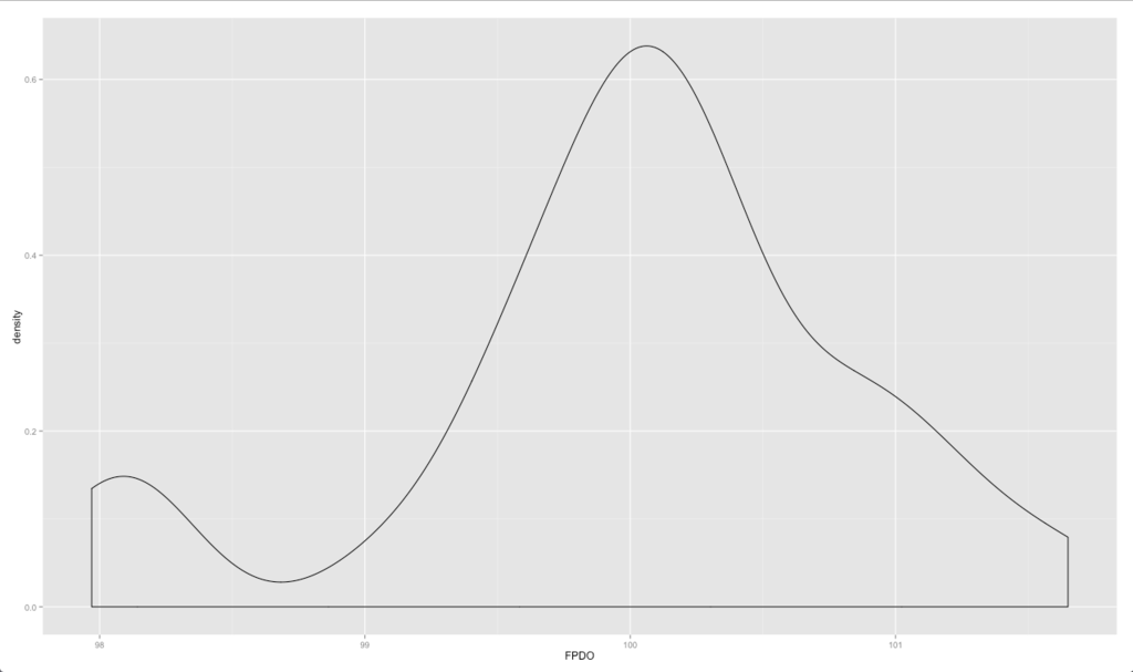
However, the distribution can be skewed differently based on which PDO metric is used – standard, Corsi, or Fenwick.
The data is slightly skewed left for the standard PDO metric:
But is closer to the expected mean for Fenwick, though still more density is seen to the right of 100:
And what one might suspect for the Corsi density plot in terms of mean but with more density on the left-side of the graph:
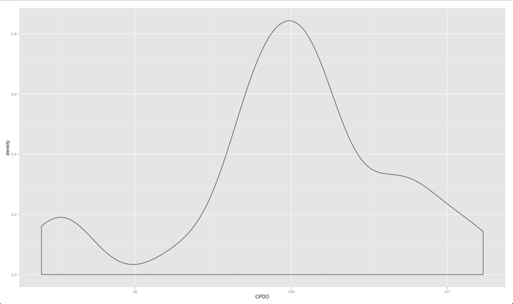
Comparing Corsi and Fenwick PDO versus Standard PDO
Corsi and Fenwick PDO are not more effective in predicting performance sustainability than standard PDO.
In two regressions comparing season points total versus PDO and CPDO and another comparing season points total versus PDO and FPDO, only standard PDO fit significance requirements and fit the expected coefficient magnitude.
On average, a one-percent increase in PDO will generate an increase in the following season points totals by the following projections (95% confidence intervals):
-
-
- PDO: 6.2-13.3
-
- CPDO: 14.5-21.6
-
FPDO: 10.3-15.7
There is no consistent overlap between the three, but might be best estimated somewhere around 13 points over the course of a standard 82-game season based on statistically significant values obtained across various regression models.
Instead of standard method of moments confidence intervals, we can also use bootstrapping methodology as a resampling technique to obtain a better grasp of 95% confidence values.
Based on this technique, we obtain the following expected points value (over 82 games) based on a one-percent increase in the various PDO metrics:
-
-
- PDO: 6.3-12.2
-
- CPDO: 14.7-20.3
-
FPDO: 10.5-14.6
Bootstrapping also gets us a more precise range of PDO value than standard confidence interval testing.
Here we obtain an estimate that a one-percent increase in PDO is worth approximately 12 points on average, which isn’t too far off from our approximation of 12.5-13 points earlier.
Conclusion
1. How well does the metric effectively predict season points totals?
2. How well did PDO data predict playoff results?
3. How does CPDO and FPDO compare in predictive effect relative to standard PDO?
4. Where should PDO, CPDO, and FPDO stand in the hierarchy of hockey analytic metrics?
From the regression models used in this study, some inevitable aspect of hockey performance during the regular season is a consequence of whims and luck that can’t be inherently controlled.
This is most prominent in determining who the top points-getters are.
For example, there is on average, less of a gulf in talent between a 110-point team and a 100-point team, than a 100-point team and a 90-point team based on the sensitivity of the PDO curve.
In this sense, the results of what is reported here don’t seem to distinctly provide much assistance in better concrete decision-making.
However, it can help assist a front office in determining how sustainable their current performance is (or was) and what their actual projection might be.
A team with very bad luck (e.g., a PDO of 98) that finished with 90 points, might not genuinely be that far off from contending. The best regression model’s estimates suggest that a 90-point squad with a 98 PDO might legitimately have the talent and potential of a 114-116 point performer, which would normally rank it at the top of the league.
A combination of standard Corsi and Fenwick metrics in addition to PDO data can help predict playoff performance, given that the playoffs are essentially just a continuation of the season with the same players, the same coaches, and with everything else controlled for.
This can make high PDO/low Corsi/Fenwick teams likely to not fare well, whereas a moderate PDO/high Corsi/Fenwick teams likely to do well relative to their regular season performance.
This was reflected with the elimination of teams like St. Louis, Montreal, NY Rangers, and Anaheim during the particular season analyzed.
Of the two Stanley Cup finalists that year, Tampa Bay was a high PDO team with strong Corsi and Fenwick ratings, while Chicago was a moderate PDO team also with strong Corsi and Fenwick numbers.
CPDO and FPDO (i.e., the Corsi and Fenwick equivalents of PDO) do not seem to have any better predictive ability than standard PDO, although Corsi and Fenwick emphasize puck possession while regular PDO does not.
PDO performed better in regression’s when paired with either Corsi or Fenwick data, naturally showing that greater degrees of unsustainability will result in regression toward the mean and displaying a high level of statistical significance.


